An eBrands Studio Case - Puzzle Ready
In this eBrands Brand Studio case-study, we're diving into Puzzle Ready, a hobby supplies brand committed to giving everyone the opportunity to master a new hobby (or improve a beloved one).
Our ambition for the brand was to develop a new identity that would resonate more with potential and existing customers and then communicate this new identity to not only the brand’s existing customers, but its future customers, too. We aimed to achieve this by building a cohesive visual personality for the brand and combining this with a captivating brand story, that ultimately gave rise to a unique, honest and unexpected voice.
This put us in a strong position to expand the brand’s sales and customer loyalty in its existing sales channels, and also to maximise the value that we could demonstrate to customers during launches into new sales channels.
The next stage is to use this new identity to allow Puzzle Ready to step outside of its initial focus of puzzles only and transform itself into a multi-category crafts and hobby brand that can speak to a large range of consumers and offer more value on every purchase.
The future is in the past - How we found our inspiration for the rebrand
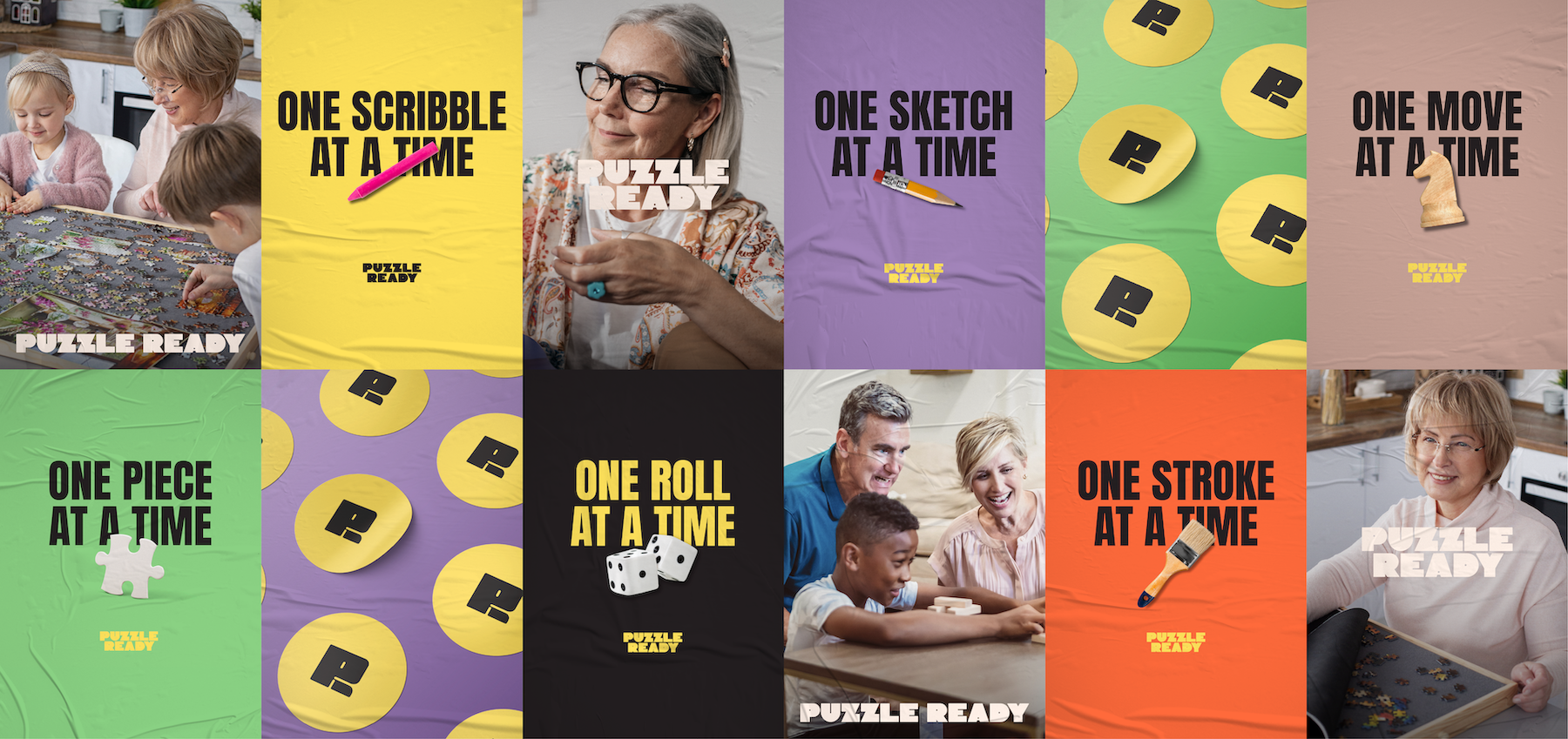
Puzzle Ready joined eBrands with the desire to breathe new life into the brand. Target consumers range from 35 to 65+, and so we developed a playful and fun identity that could give the brand the opportunity to engage with younger audiences, while still meeting the core values of the mature audiences that it already represents.
Echoing the brand’s nostalgic sentiment - to find inspiration for the brand’s new identity, we went back to the past.
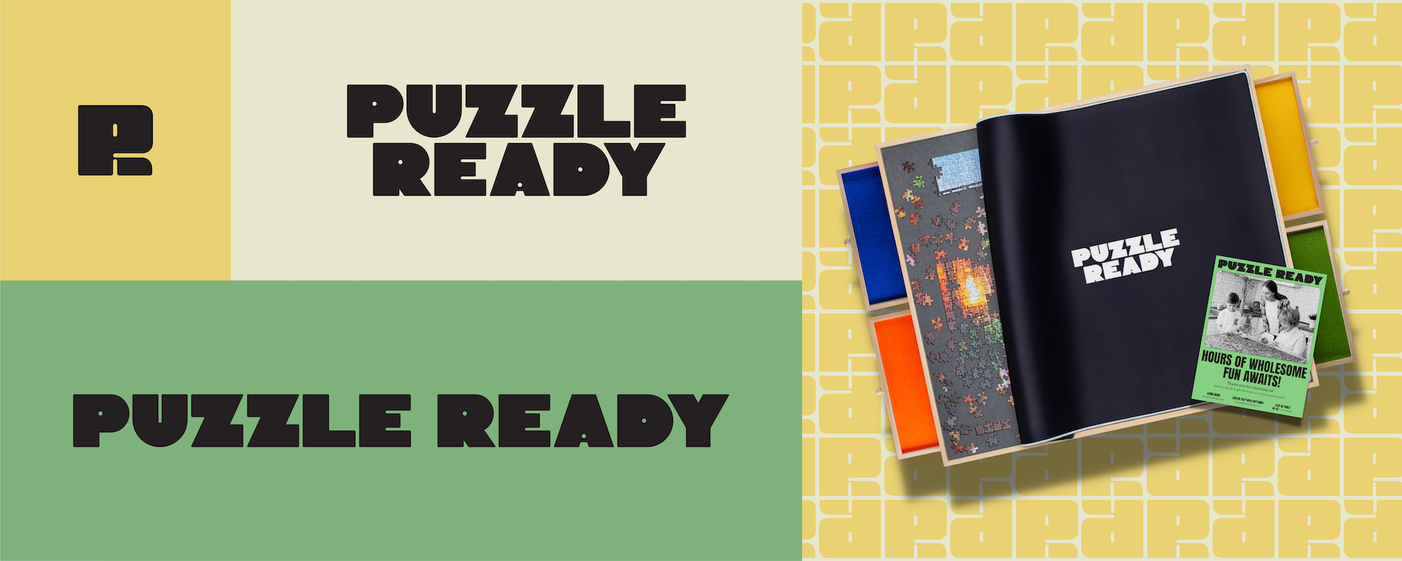
Taking cues from 70s and 80s era visuals, we created an identity that is centered around vintage board games, something that the target audience grew up with, and something that would link each of the brand’s products to positive childhood experiences.
Authentic self expression - The Creator
Having puzzle enthusiasts/passionate hobbyists – i.e. creatives – as our target audience, means that Puzzle Ready needs to come as an embodiment of innovation and self expression. The brand becomes an outlet that allows creative people to have control over an otherwise uncontrollable world. With this point of view in mind, we pivoted the brand towards an identity that positions our products as pieces of artwork - that evoke feelings of awe and artistic appreciation.
Art direction
The main goal here was to create a unique identity - that would keep us from falling into the ‘sea of same’.
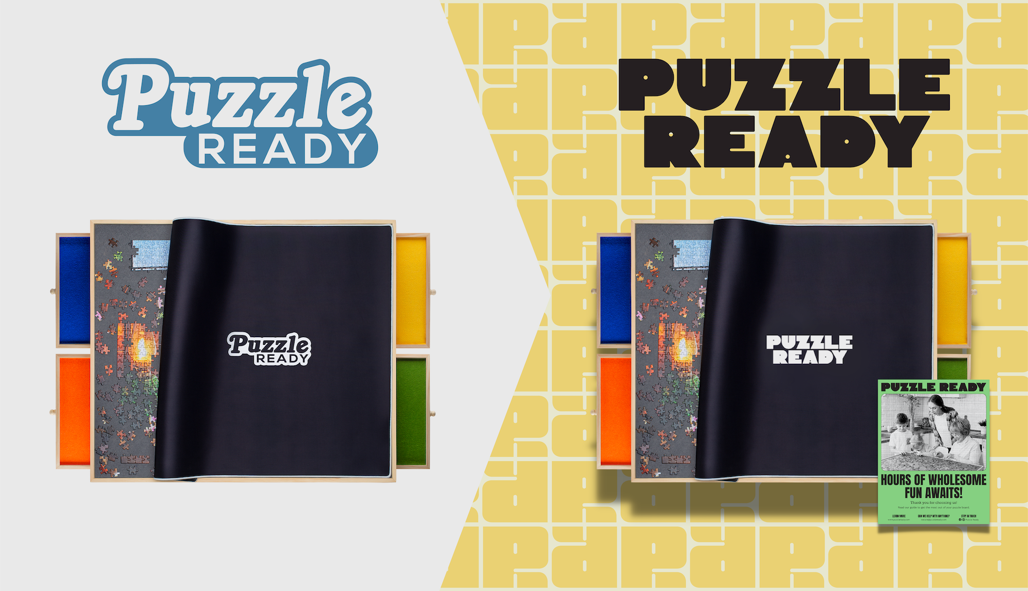
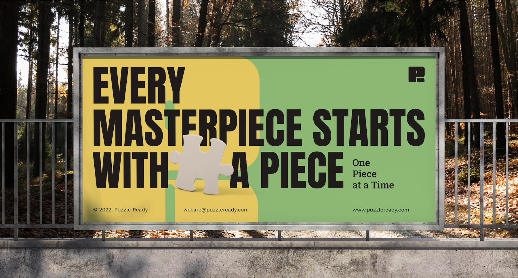
Most competing brands have ‘toyish’ brand images. This is exhibited through the use of soft typography, fair colours and smoothed lines. We designed something different. We maintained the brand’s playful personality, but instead of aiming for childlike visuals, we used a more refined colour palette and typography, and combined this with sharper lines to develop a more striking visual personality.
As part of this personality, we created a customised wordmark. The abstract typography and the lack of space in between the letters act as an homage to puzzle pieces, while each letter is also capitalized in order to capture the lively spirit of the brand.
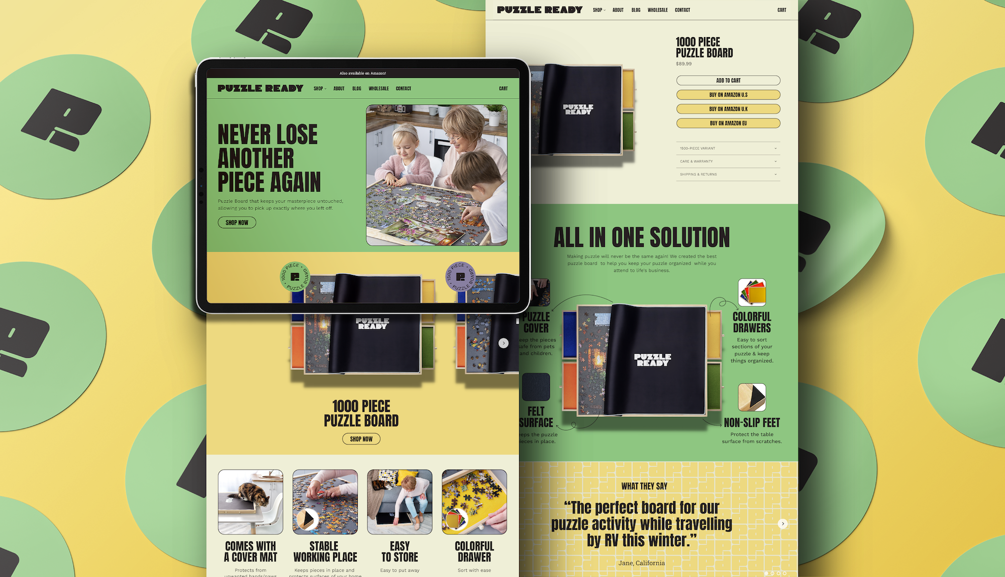
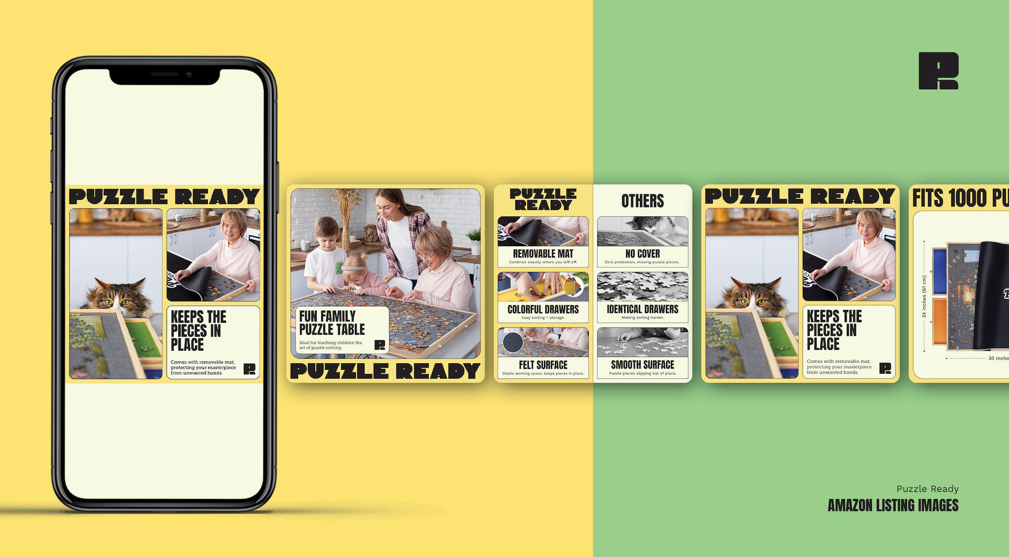
The colorful yet muted palette of the visual is a nod to vintage entertainment graphics,, taking the audience back to a less artificial, more tactile time. We also took inspiration from the puzzle board product’s colourful drawers. However, we took this a step further by refining the original product colors to establish a new and unique path that would give us a distinct look that would help us to stand out in a colour-filled category range.
To sum it up, Puzzle Ready’s new brand identity is meant to demand minimal mental resources from the customer, while still delivering the most value. A bold take on simplicity lets the brand find its own position between playfulness and refinement. The sharpness of the images and a unique colour scheme allow it to stand out. And finally, having a cohesive and unique personality offers the brand a lot of flexibility and gives the brand the chance to represent itself strongly in every possible space.
Lead Designer: Yesica Stefanie


.jpeg)

.jpeg)


%2520(1).png)
.jpeg)